Allilon Creative Collection:
Balance
The true undercurrent to the balance collection is to raise awareness for VITAL which is a children’s charity that is being supported by Allilon in 2014. VITAL is designed to try and find balance and stability for children in India. Playing with the word balance enables us to highlight the moral aspects of how we live our lives. As well as the power we hold as an industry to really help make a difference.
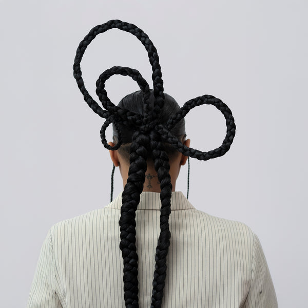
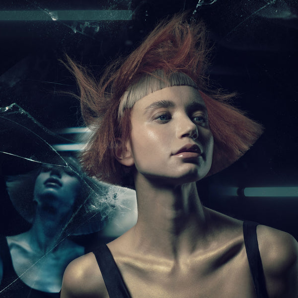
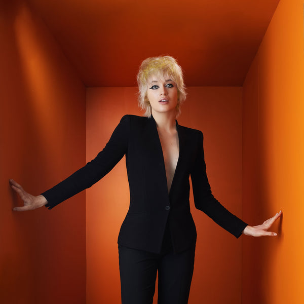
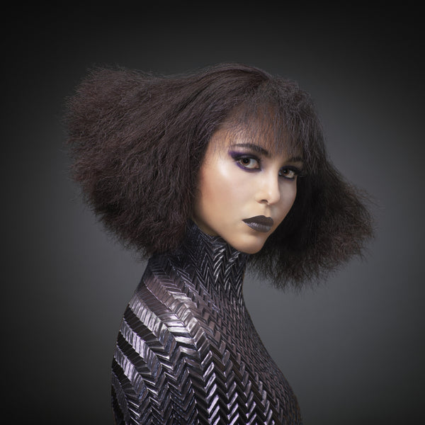
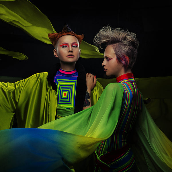
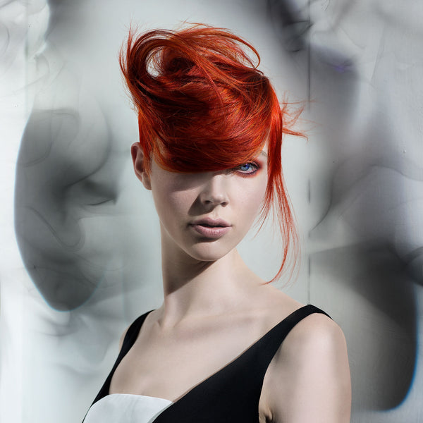
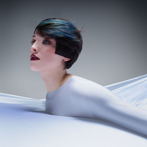
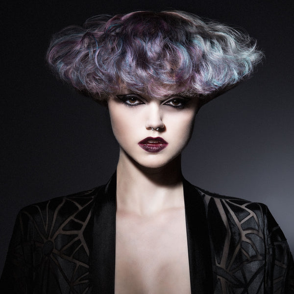
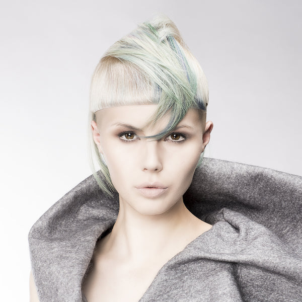
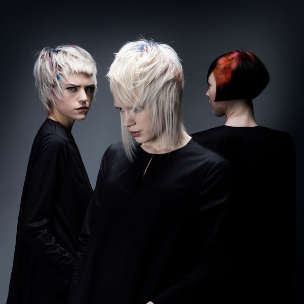
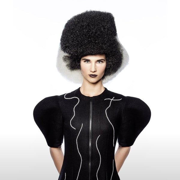
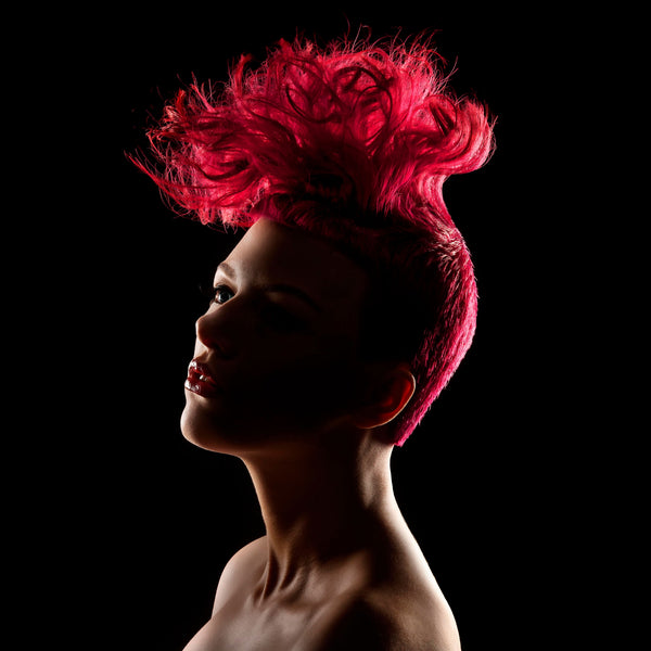
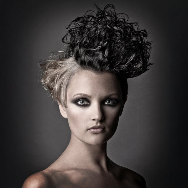
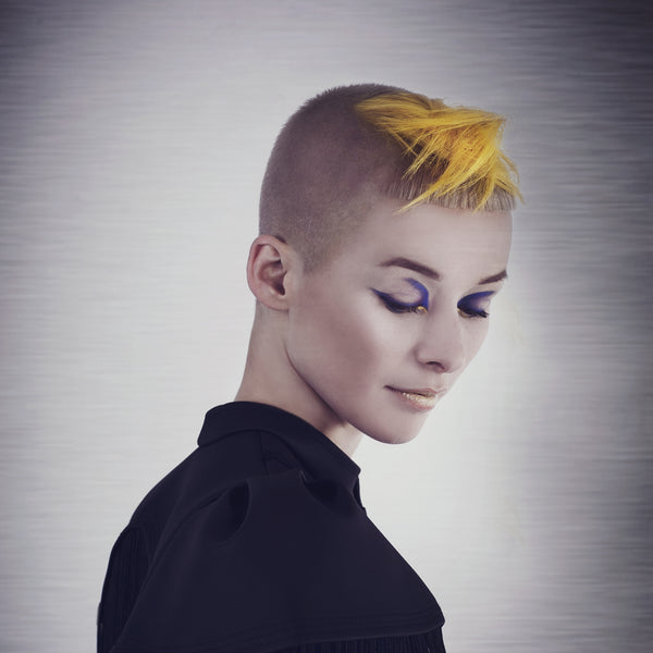
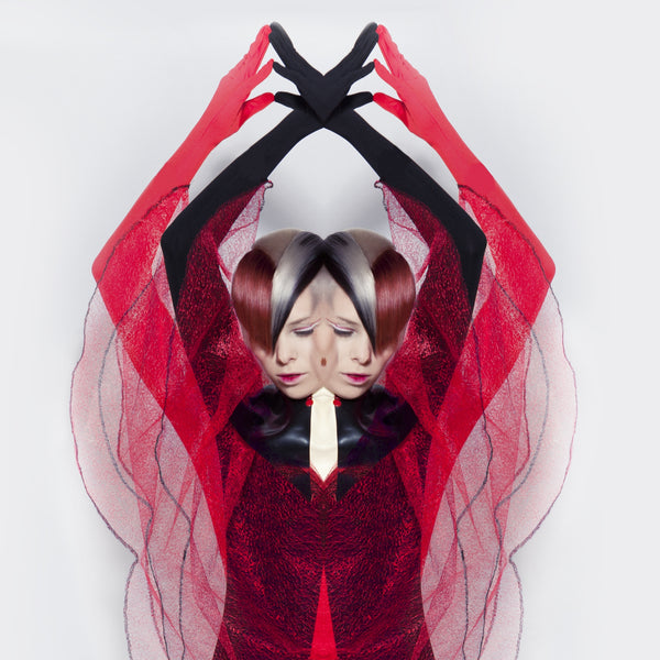
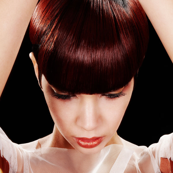
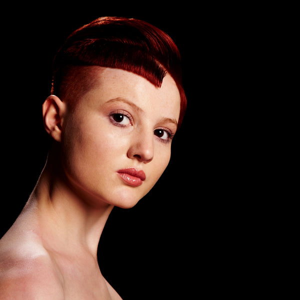
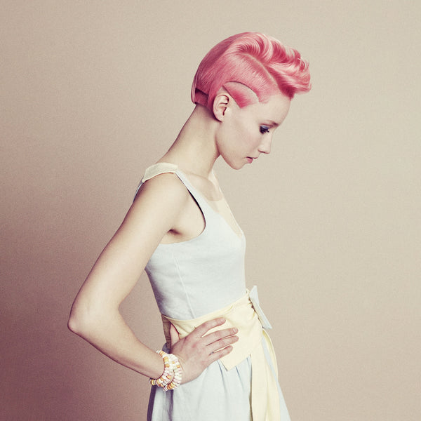
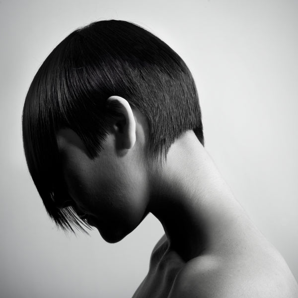
Hair flows from shapes, which are both completely symmetrical through to shapes that are truly off Balance with the use of asymmetry. Lengths where chosen to either simplify the looks due to strong bold colours, where as more dynamic shapes where chosen to compliment simpler colours.
Colours in the balance collection use the idea of the contrasting primary & secondary tones, opposite each other on the colour wheel, together to give a feeling of ‘balance’ by neutralising each other. Sectioning patterns are taken from the outfits and ‘sari’ material, with colours emulating the rich fabrics and colours of India and making reference to ‘Vital’ and the charities bright, happy and beautiful work.
“Ironically the eye does not naturally except the placement of the contrasting colours together which was the challenge we had to overcome when creating the colour story for BALANCE“
– Madeleine Murphy
CLOTHES
Drawing reference of draping silk from Sandro Botticelli’s interpretation of Venus, who is often used as an icon place on the symbol of balance in astronomy. The finest silk was used in create shapes of an hourglass figure, with a tight waist and flowing curvaceous shapes above and below for soft movements.


More Collections
